Well Fed Logo
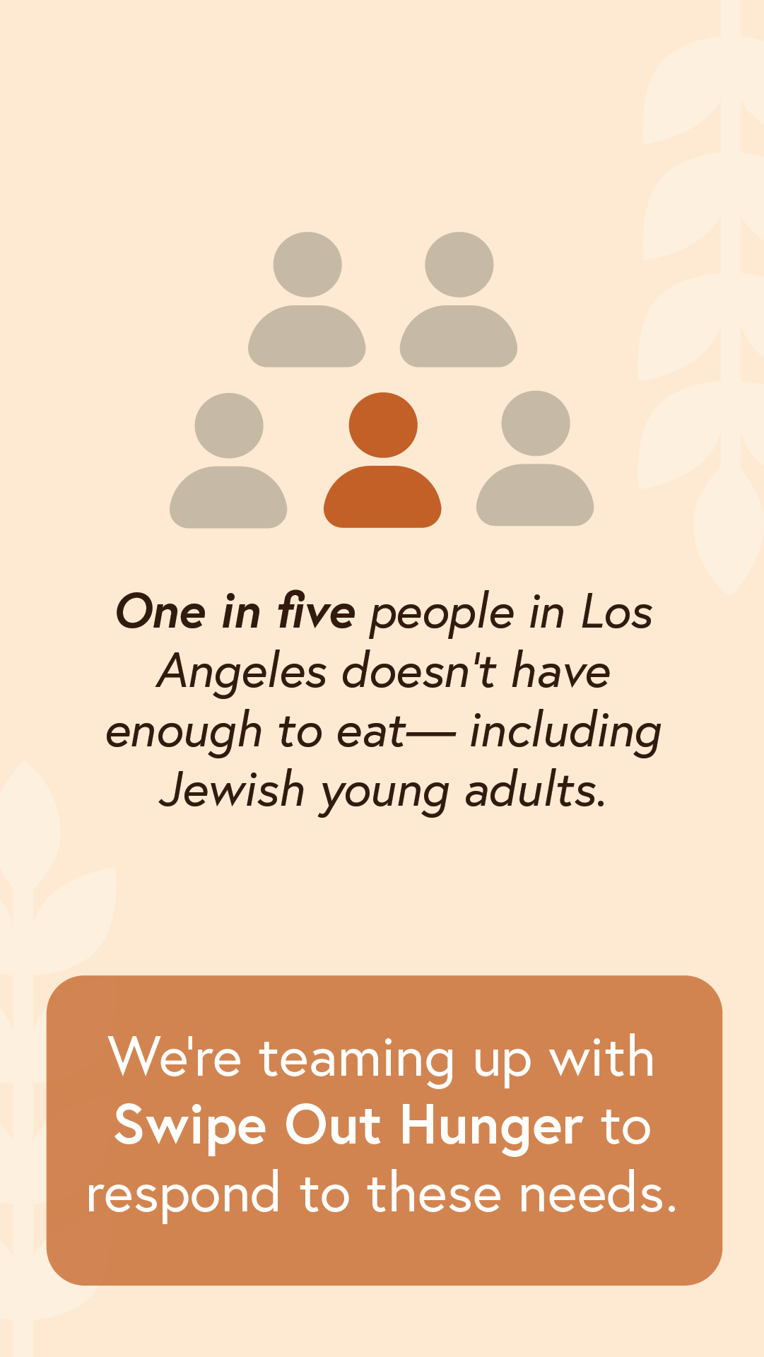
Developed brand and assets for “Well Fed”, a campaign Swipe Out Hunger had win collaboration with the Jewish Federation of LA. The campaign targeted food insecure students and young adults (18-40) in LA, encouraging them to fill out a short application to be eligible for a $250 grocery gift card.
Logo Design
Iteration 1
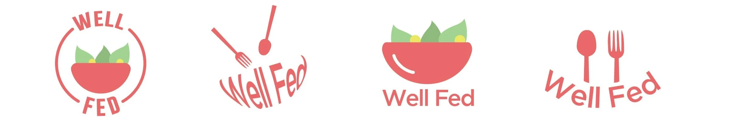
For the first iteration of logos, I used a red color with a sans serif look for a cleaner and more modern look. Additionally, I used a salad bowl and utensils to connect the logo to the theme of food.
However, the logo didn’t seem quite right. There were a few problem areas:
The logos looked like they were aimed for younger (12-18) audiences -> Should be a more mature and sophisticated look
The salad and utensils made the logo seem like it was for a restaurant or food place -> Add a humanistic element that suggests support and reaching out
Because there wasn’t a logo that I was particularly fond of, I decided to scrap this iteration and start a completely new concept.
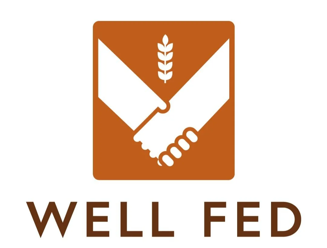
Iteration 2

Final logo
Assets
I used the font Europa-bold, a sans-serif font that was clean, modern, and meshed well with the roundness of the logo. I replaced the heart with a wheat to tie the logo to the mission of providing food assistance. I switched the dark red color out for a burnt orange, which brought back the inviting feel, yet still seemed mature and sophisticated.
The logo has a clean, sophisticated, and inviting feel that conveys the message of food assistance.